
This project contains the front-end code for the landing page of a fictional Bakery. It uses only HTML and CSS & SCSS. The design was shared in Figma by a web design student Olga. I had a chance to transform her vision into code.
Project purpose and goal
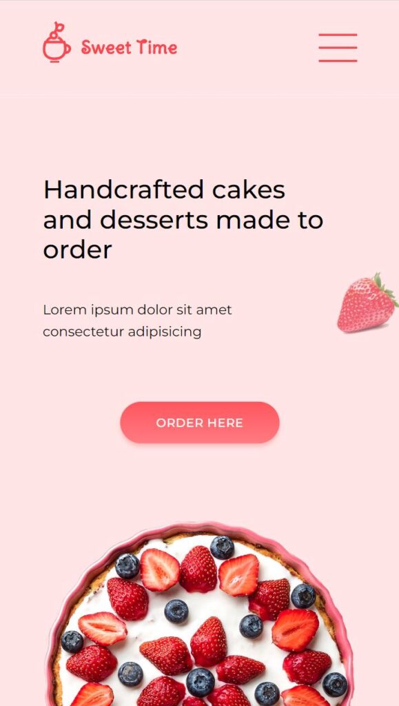
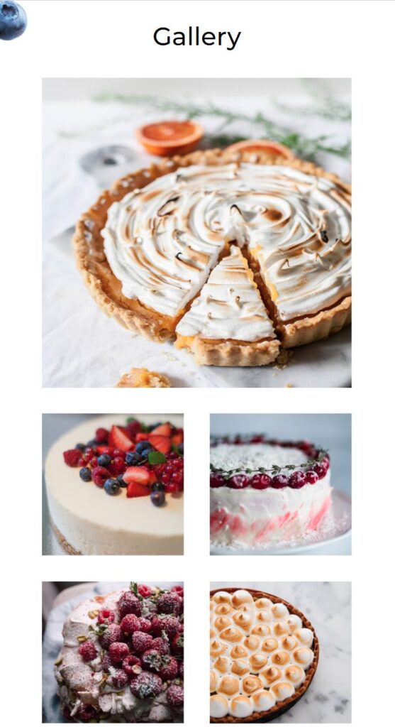
This project was intended to practice the skills acquired in the Advanced CSS and SASS course. The goal was to code from scratch a layout in HTML and CSS based on the design provided by a professional designer. I also made it fully responsive so it looks good on any device.
Overview
I coded the landing page using SCSS as this was the most convenient way to code a complex layout. I used separate template parts for each section and imported them into one final main.scss file. The structure of the SCSS code can be viewed on GitHub here.
I used NPM packages to convert SCSS code into plain CSS, prefix the code for multi-browser support, and finally concatenate the CSS code.
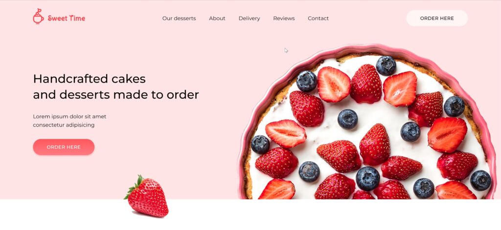
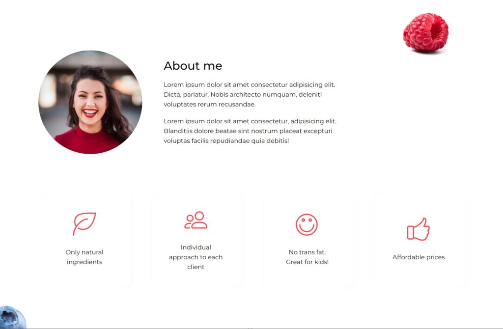
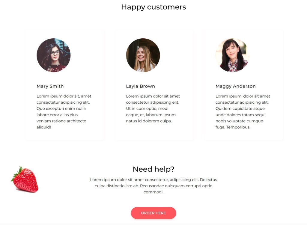
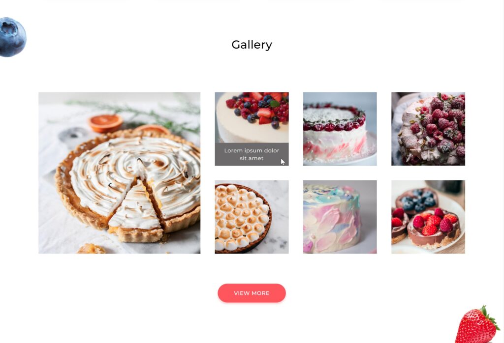
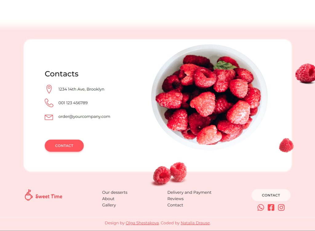
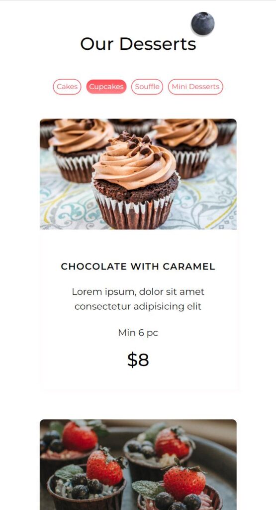
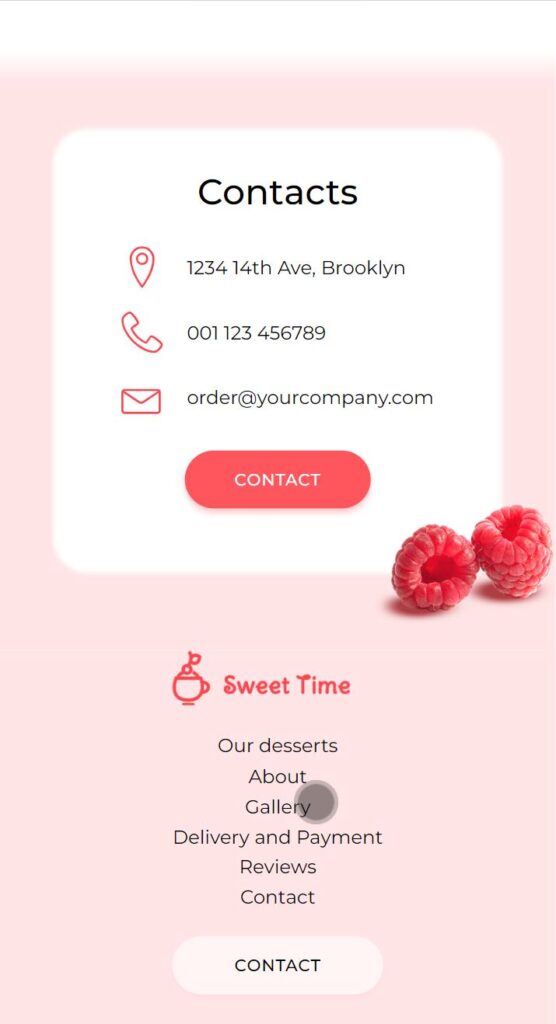
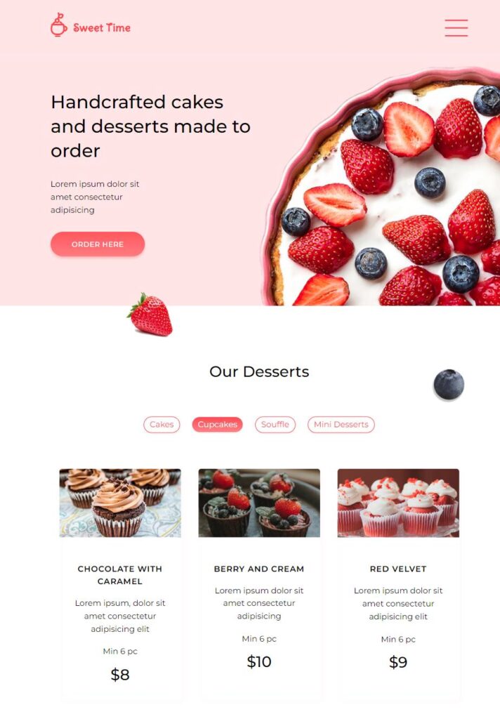
The landing page contains several sections: Navigation Menu, Hero Banner, Pricing table, About section with feature boxes, Gallery, Testimonials, Call to Action, Contacts, and footer.
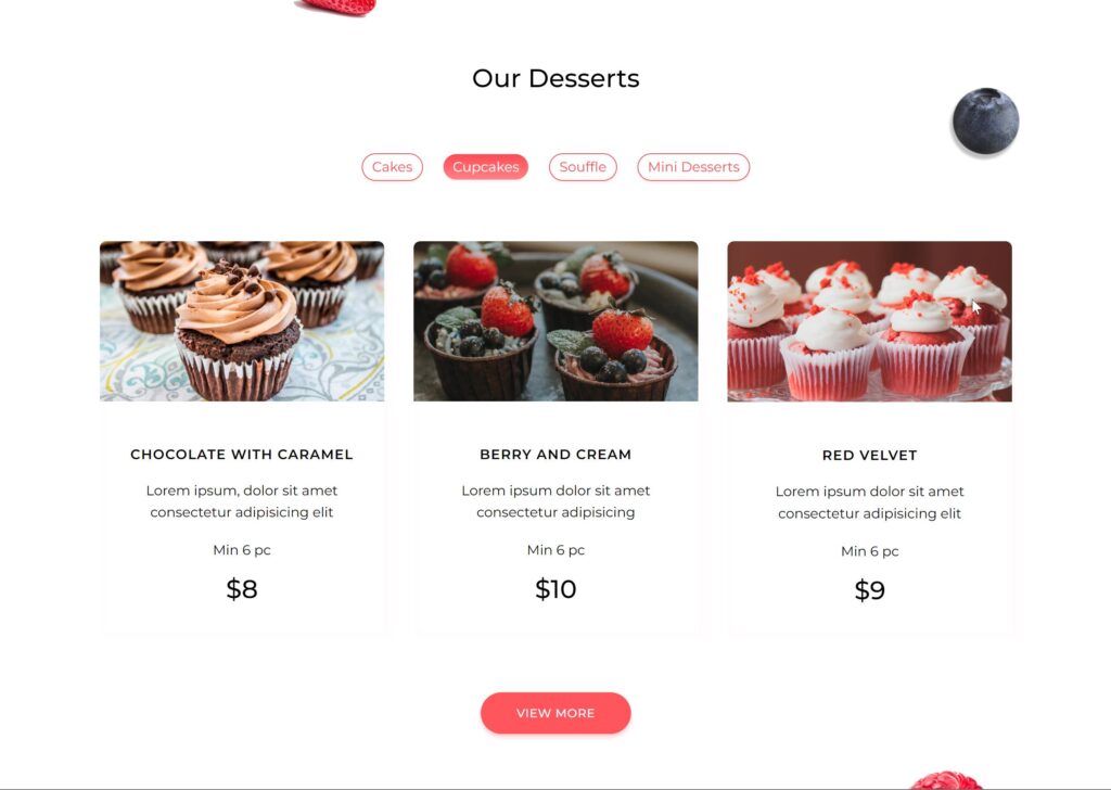
I used primarily grid layout, and some elements utilize flexbox. The design highlights animated buttons and gallery items that display captions on hover.
The landing page is fully responsive and contains breakpoints to adjust to tablet and mobile devices.
Problems and thought process
The layout contains a few floating images. It was a bit challenging to position these images for each device type, so I had to use a few breakpoints to maintain the accuracy of the design while keeping the elements displayed regardless of the device.
Olga – the designer – reviewed the design throughout the development process and noticed a few layout issues I oversaw (mainly related to alignment). Thanks to her input I was able to see the code from the designer’s perspective and make adjustments that improved the look of the page.
This was a fruitful collaboration where I learned the problems that might come up while coding a complex design, and I was able to experience the process of working with a professional designer and ways to address their requests and concerns.