This project is all about the front-end code for my portfolio landing page. I built it using CSS (written with a SASS structure) and added some JavaScript for the navigation menu to make it smooth and easy to use.

Project purpose and goal
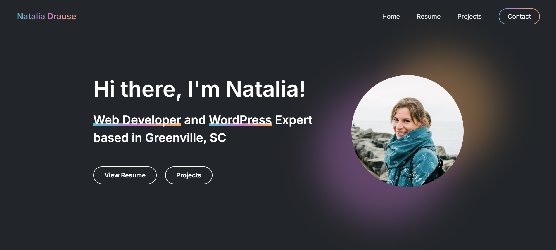
I wanted to design a stylish, eye-catching landing page for my portfolio that feels fun yet professional. I also aimed to put into practice what I learned from the Build Responsive Real-World Websites with HTML and CSS course on Udemy. Another big goal was to use the best SASS practices for a scalable design, inspired by the Advanced CSS and Sass online course.
Overview
The project leans on CSS with a SASS setup to keep things scalable and organized. I kicked off with a file structure that lets me reuse components, add new pages, and even switch themes—like light or dark modes—down the road.
sass/
├── abstracts/
│   ├── functions.scss
│   ├── mixins.scss
│   └── variables.scss
├── base/
│   ├── animations.scss
│   ├── base.scss
│   ├── typography.scss
│   └── utilities.scss
├── components/
│   ├── buttons.scss
│   ├── cards.scss
│   ├── cta.scss
│   └── glowing-elements.scss
├── layout/
│   ├── features.scss
│   ├── footer.scss
│   ├── forms.scss
│   ├── grid.scss
│   ├── header.scss
│   ├── hero.scss
│   ├── intro.scss
│   ├── navigation.scss
│   ├── projects.scss
│   ├── sidebar.scss
│   └── skills.scss
├── pages/
│   └── home.scss
├── themes/
│   └── default.scss
└── vendors/
I used NPM packages to turn my SCSS into plain CSS, add prefixes for cross-browser support, and bundle it all together nicely.
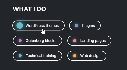
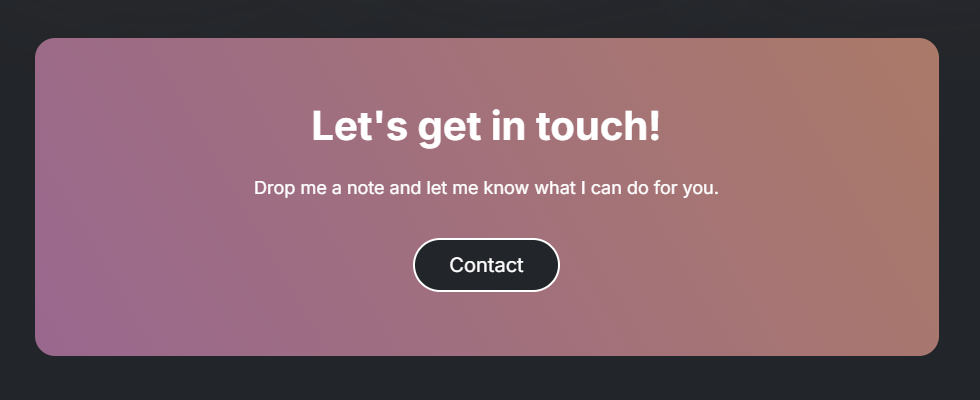
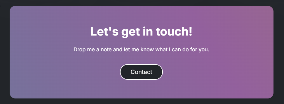
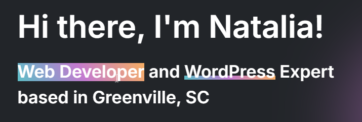
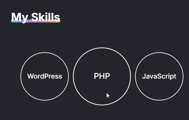
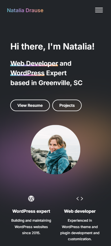
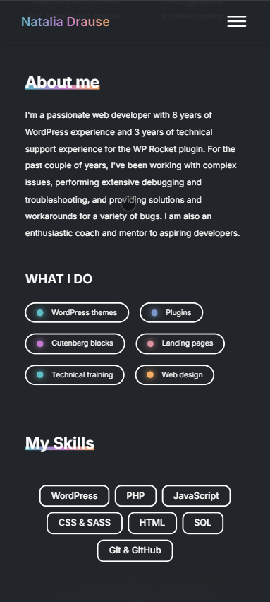
The landing page features several sections: a Navigation Menu, Hero section, Features, Intro, Skills, a Projects section (showcasing recent blog posts), a Call to Action, and a Footer. I mainly used a grid layout, with flexbox for some elements to get the spacing just right.
To keep things lively, I added animations! For example, the Recent Projects section has a spinning gradient background, and the Call to Action shifts colors with a moving gradient. Hover effects on tags, text, and buttons add a little extra fun too.

The landing page is fully responsive, with breakpoints to adapt perfectly to tablets and mobile devices.


Problems and thought process
While designing, I kept WordPress in mind—thinking about how to reuse content like tags, categories, and blog posts in the layout later on. It was a fun challenge!
I also wanted animations to spice things up without overdoing it. I aimed for a minimalist look with gradient colors that feel right for a programmer’s site while showing off my personality. Picking the color palette was tricky but rewarding!